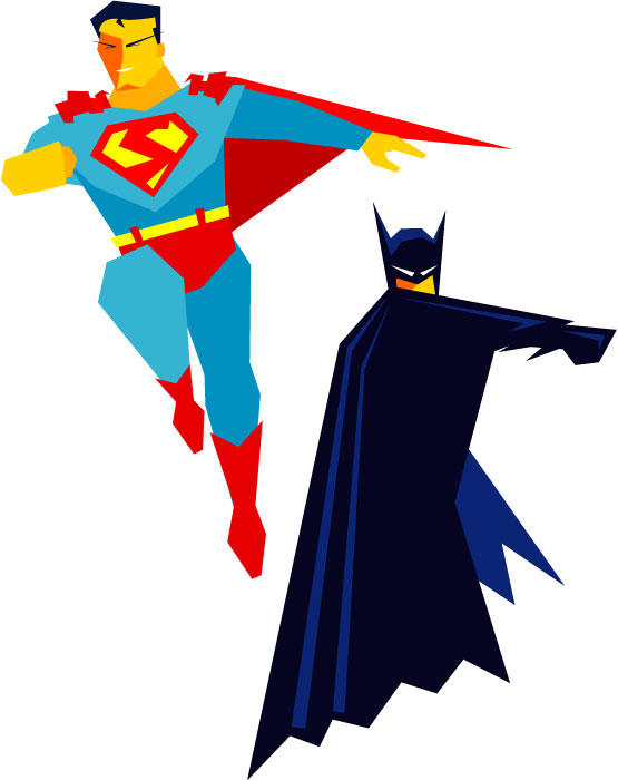
Here are the first two experimental figures I did for my cut paper project. I'll get to it, I promise... Stop looking at the crossed fingers behind my back.
Anyway I really do like how these turned out. I was able to create them with out any gradients or curves which were the only guidelines I had set for myself. Sometimes good things come from being boxed in. Sometimes they don't, but that's rare.
Just a couple notes here in case anyone was curious. Yes... the "S" is not the same as the actual Superman shield. To be honest it just didn't look right without curves... so I improvised. And I like the result.
In retrospect, Superman feels a little stiff compared to Batman, and the Flash illo I posted a couple weeks ago. But hey, I'm making this up as I go along so cut me some slack. Maybe in the future I will add backgrounds to these to give them some context. I can totally see the back of some fedora wearing thug's head way up in the foreground being snapped back by the force of Batman's fist.
Comments anyone? Good? Bad? Ugly? Fair to middling?
1 comment:
I like them. Schmandy-bro is very talented! I don't know what gradients are, and that "Flash Illio" reference puzzled me, but Superman looks awesome. Batman, too! How about a Supercat? With strange little speckles, maybe? Leaping onto a fuzzy spiderman toy? There's a superhero connection!!!
Post a Comment