Monday, September 26, 2005

Illustration Friday - Fresh!


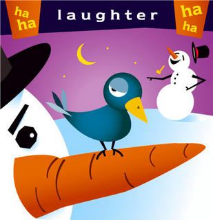
Ok... Look I had a completely different idea than what's posted here. I had this drawing I did of a bunch of fresh underpants. Nunderpants, Thunderpants, Wonderpants etc etc... But I don't have a scanner. That meant I'd have to carry this sheet of paper all the way to work on the commuter train. Too much effort to try and keep it flat and uncrumpled, especially when the jackass sitting next you has to open his legs so his "boys" have some room to lounge about. But I digress.

I borrowed from a few other things I did and came up with this gem.

Oh that bee... what a rascal... what a rapscallion. He's just trying to get some. And the flower is all "Access Denied". Yeah wait till your petals turn brown and your leaves sag.. you'll wish you had bees buzzing about you then. You'll be lucky to find an earwig willing to climb your stem.
Wednesday, September 21, 2005

More heroes...


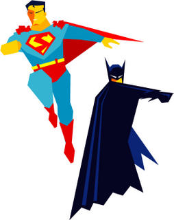
Here are the first two experimental figures I did for my cut paper project. I'll get to it, I promise... Stop looking at the crossed fingers behind my back.

Anyway I really do like how these turned out. I was able to create them with out any gradients or curves which were the only guidelines I had set for myself. Sometimes good things come from being boxed in. Sometimes they don't, but that's rare.

Just a couple notes here in case anyone was curious. Yes... the "S" is not the same as the actual Superman shield. To be honest it just didn't look right without curves... so I improvised. And I like the result.

In retrospect, Superman feels a little stiff compared to Batman, and the Flash illo I posted a couple weeks ago. But hey, I'm making this up as I go along so cut me some slack. Maybe in the future I will add backgrounds to these to give them some context. I can totally see the back of some fedora wearing thug's head way up in the foreground being snapped back by the force of Batman's fist.

Comments anyone? Good? Bad? Ugly? Fair to middling?

Saturday, September 17, 2005

Illustration Friday | Escape


Sometimes you feel like a pig... some times you don't. It's all in your mind. Sheldon knows that... look at that pig fly. Every night that pig can escape, and for 8 hours he can be what he really wants to be. Isn't that what we all want? I need to be more like Sheldon.

Thursday, September 15, 2005

Christmas comes early.


I'm trying hard to post to this blog with some kind of regular frequency. While I've not done anything completely brand new since the "roots" exercise, I promise to do so in the future. In fact I really need to. For now though, my fans (all 2 of you) will have to be satisfied with another couple of oldies but goodies.

These 2 illustrations were done for our company Christmas card. Each of us was given a few words to illustrate, and these two were mine. I think there were a dozen in all and they ended up being the size of a large postage stamp. I loved doing it and once I started I couldn't want to stop. I must have been having fun.

Anyway let me know what you think. Or don't... Or just think quietly to yourself.

Sunday, September 11, 2005

Just wanted to say...


This is a goofy girly illustration.. but my wife likes it, and she asks so little of me, so I'm posting it for her. And please, do have a nice day.

Friday, September 09, 2005

The word for today is... Depth


Wow! I'm amazed that I'm actually making another post here. I am deadline driven, or at least assignment driven... It's hard for me to get anything done with out having the proverbial piano hanging by a thread above me. So here's my second Illustration Friday assignment! Depth!

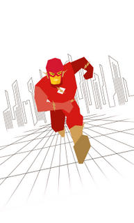
The Flash illo was something I had created a few weeks ago. I was fascinated with cut paper and started creating "cut paper" figures in Adobe illustrator. They were to be test runs for the actual cut paper piece. Needless to say, I have not reached the cut paper stage yet.

Anyhoo, even though it's a very two dimensional looking piece, I used size and colour to convey depth of field. The other restriction I had set for myself was that I wanted to use only stratight lines... no curves. I added in the cityscape as an homage to Carmine Infantino. Carmine was the artist on a great number of Flash comics in the 60's, and he created these expansive futuristic cityscape backgrounds. The Flash always seemed to be running in a giant open tiled square, with the city looming miles in the background.

So there you have it.

Thursday, September 08, 2005

Illustration Friday... the first of many I hope.


So I came across this site called Illustration Friday. Basically the idea is that you are given a word and you have a week to illustrate it. Anyway you want. Any medium you want. At your own pace. Ah... now those are my kind of parameters. The word this week is "roots".

My solution is posted here. I don't know if there's any greater meaning than the literal one, but if you happen to think of something good, let me know.

Good eve.

Procrastination Station... all aboard.

I get inspired very easily. I get started on things eagerly. I rarely finish what I start.

But it's not my fault... honest. it's my personality type, INTP. I won't bore you with the details, but basically my enthusiam for a project takes a sharp nose dive over time. I am content to live with things as they are... unfinished. Actually, not really content, more like too lazy to do anything about it.

Why am I telling you this? Because I'm letting you know, way in advance that my posts here will be sporadic, and possibly non-exist as time goes on. I can't help it. Not my fault. I didn't do it. That's the way it is. Que sera, sera.

Inspiring first post, no?

Well, onward, upward and ever forward. Here we go.