Literal... so literal. Because I'm lazy. This is something I did quite a long time ago... almost 10 years ago in fact.
At the time I had been working for a man who had a client base existing almost solely of real estate agents. Most (all) of the stuff we did was ass-ugly. The ugliest shit you can imagine. Business cards that were just covered in phone numbers and cell phone numbers and fax numbers and home numbers and work numbers and on and on and on. Never before had a 2 by 3 and a half inch piece of cardstock held so much information. I never understood why these agents felt the need to have 4 or 5 phone numbers on their business card. If I were a client and I couldn't reach my agent after trying the second number listed, it would be time for me to find a new agent. Well what can you expect from someone who thinks being pictured on their business card wearing a gigantic plastic ear would somehow make clients think he was listening to them.
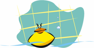
So, on to the duck. The duck came about because one of these real estate cats wanted to have a children's chore chart on the back of his junk mail (that's what it was... hey I'm being honest). After poking through the pitiful Corel clip art we had, I decided I would illustrate it myself. I had never done anything like this before, but it beat the hell out of squeezing a dozen phone numbers on a business card. I did this illustration to represent taking a bath. I also did one for brushing your teeth, making your bed, and something to do with toys. I can't tell anymore from the illustration.
I look back at it now and there are things I like about it, and things I don't like about it. I love the tiled wall and the fact that it is an almost abstract shape. The duck.. well that's another story I like the tones of yellow and orange and that's about it.
Geez I am going to run out of old artwork and I'll have to start doing new stuff in order to keep up with the weekly Illustration Friday submission. Well that's par for the course for me. Don't do anything until I absolutely have to.
Until we meet again.

